Logo Design, Freelance
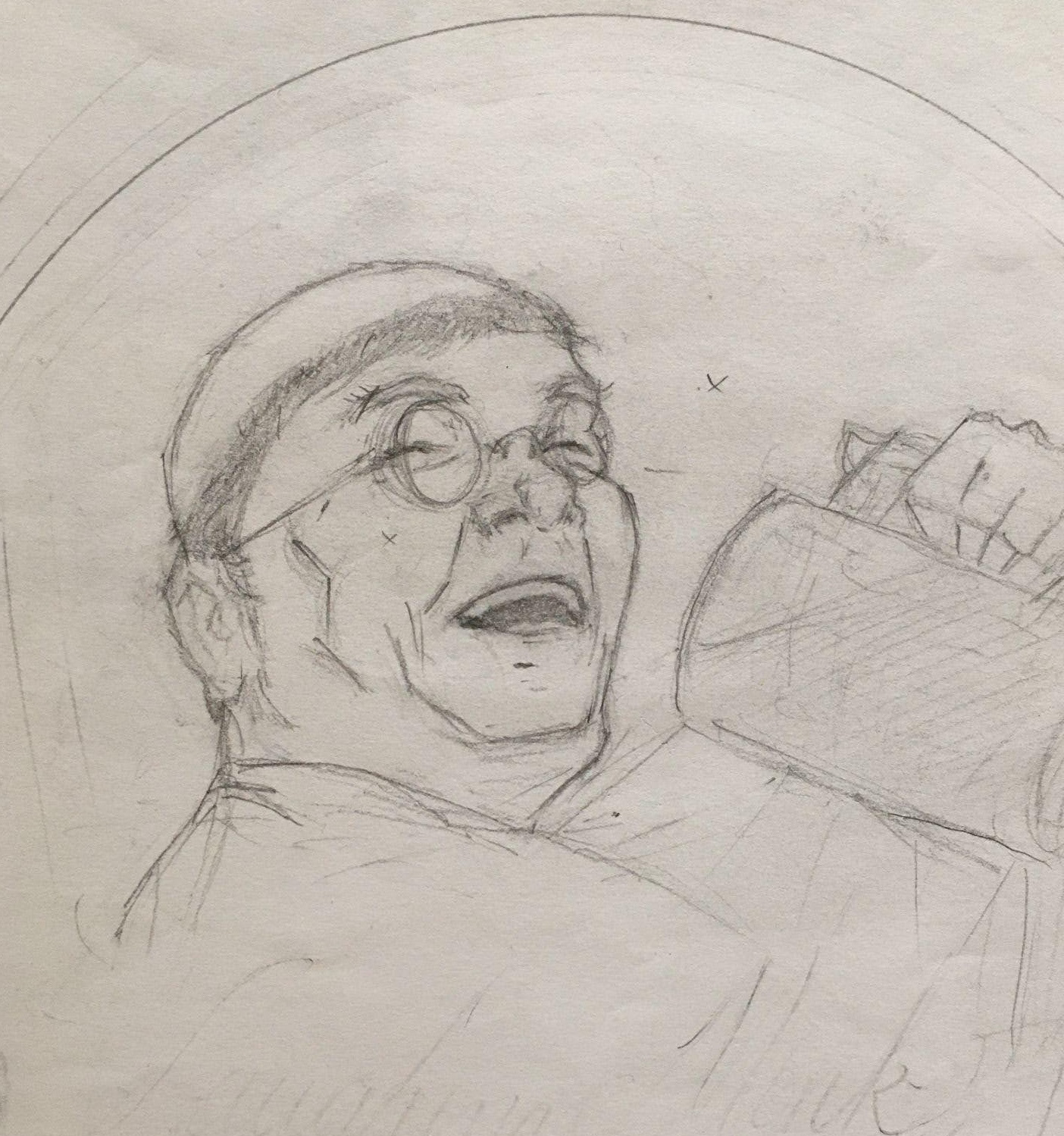
Original Sketch of Laughing Monk Logo
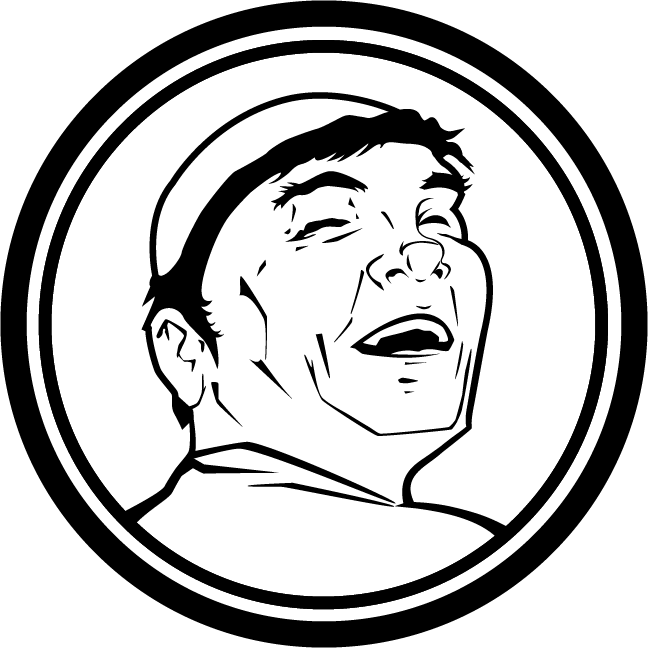
A lot of my commission work start out as sketches drawn in pencil. From there, I create a digital scan and hand-trace them into scalable vectors.
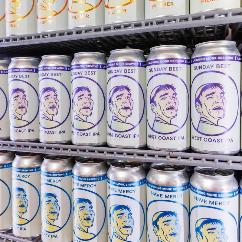
The client desired an icon that harkened back to the labels of old-style Belgian beers and reflected their name, Laughing Monk, in a quick and direct way.
Here are some of the early, preliminary drafts.
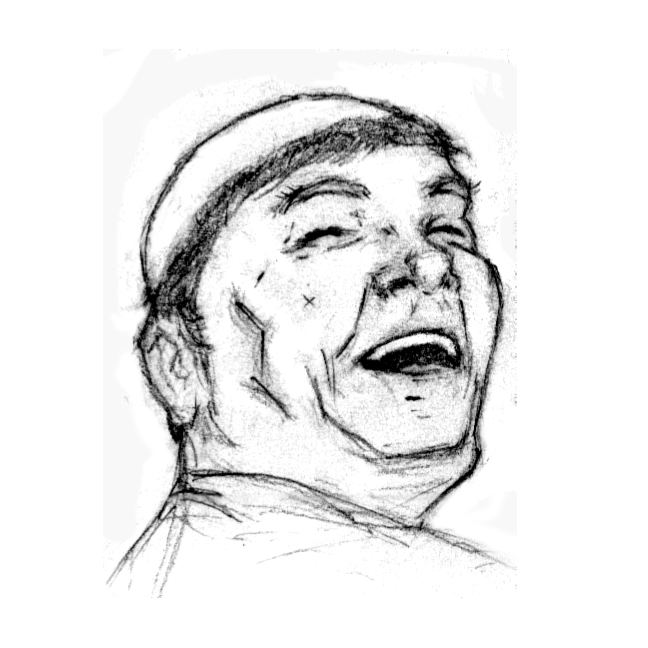
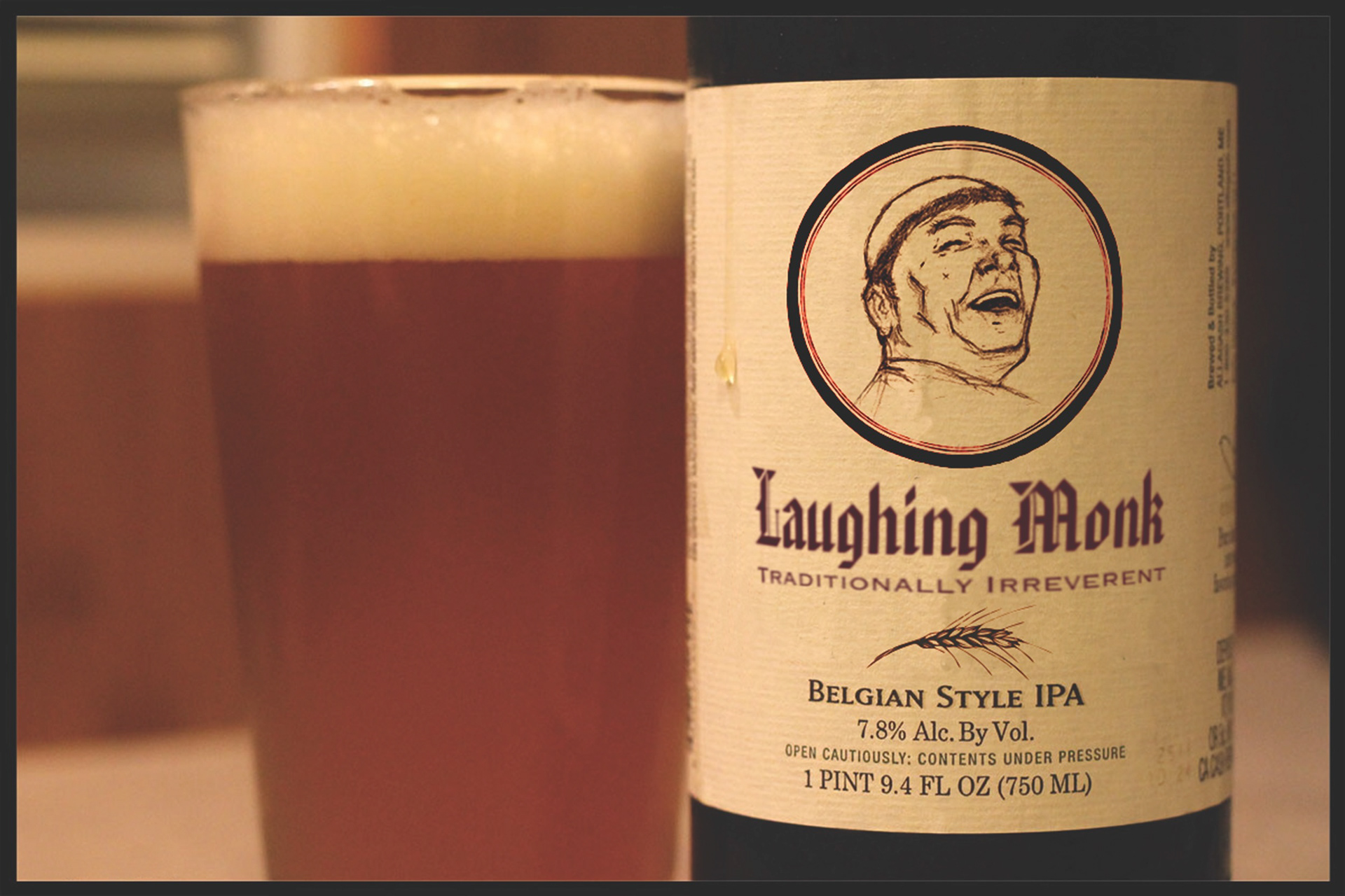
We did mockups and really leaned into the look & feel of old brands of Belgian style beers at first, but something still wasn't working.
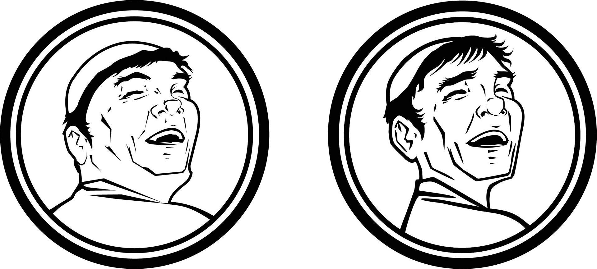
I made some refinements to the structure of the monk's face and eventually landed where everyone was happy, including this guy.

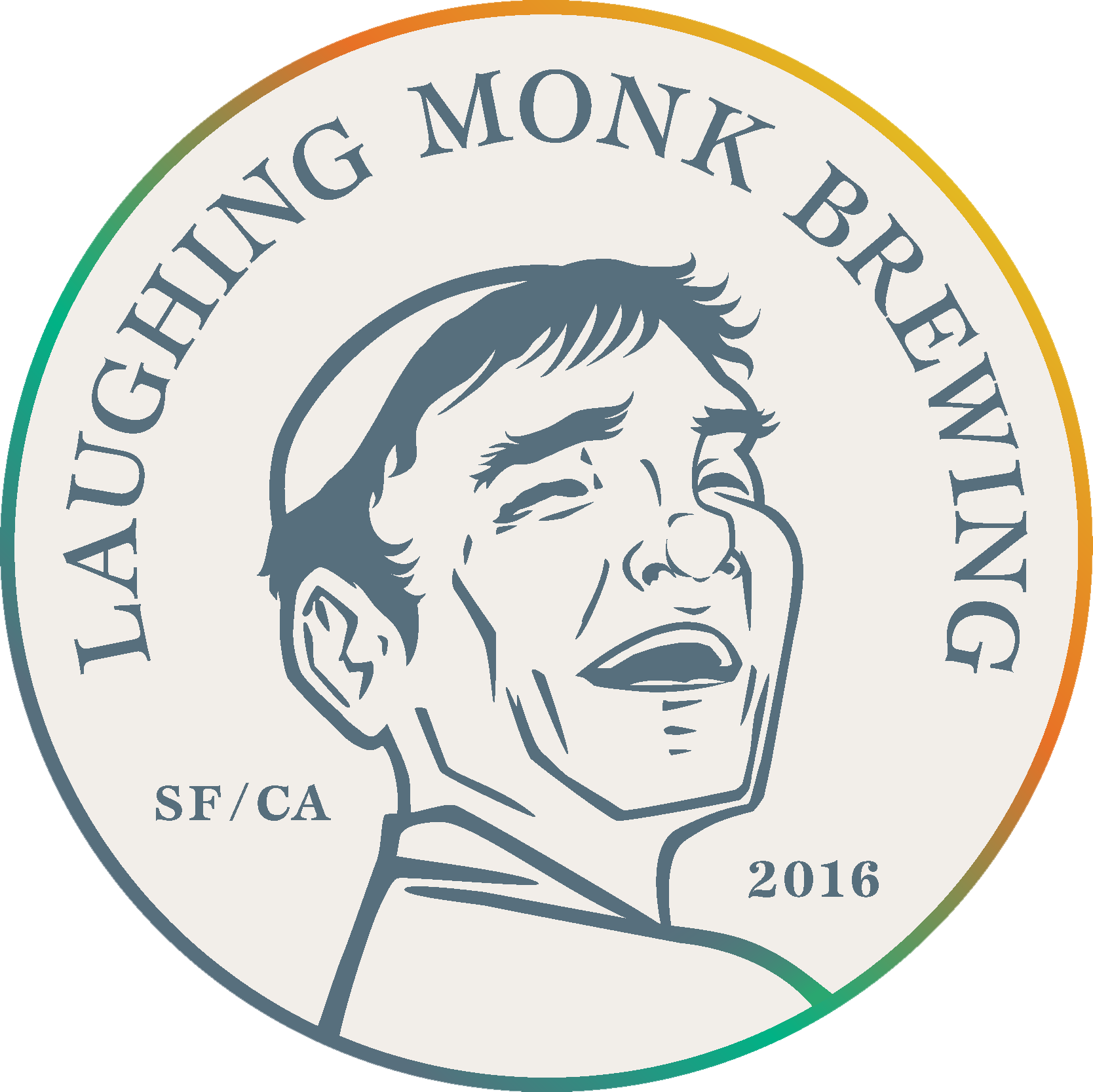
The Final Logo
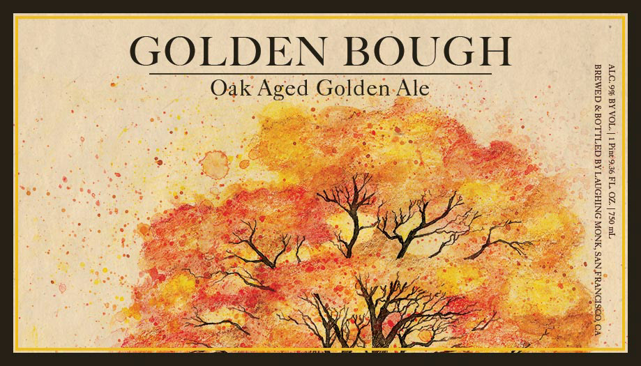
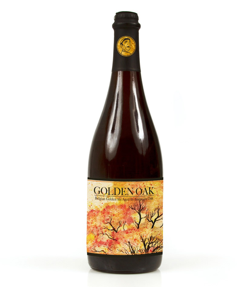
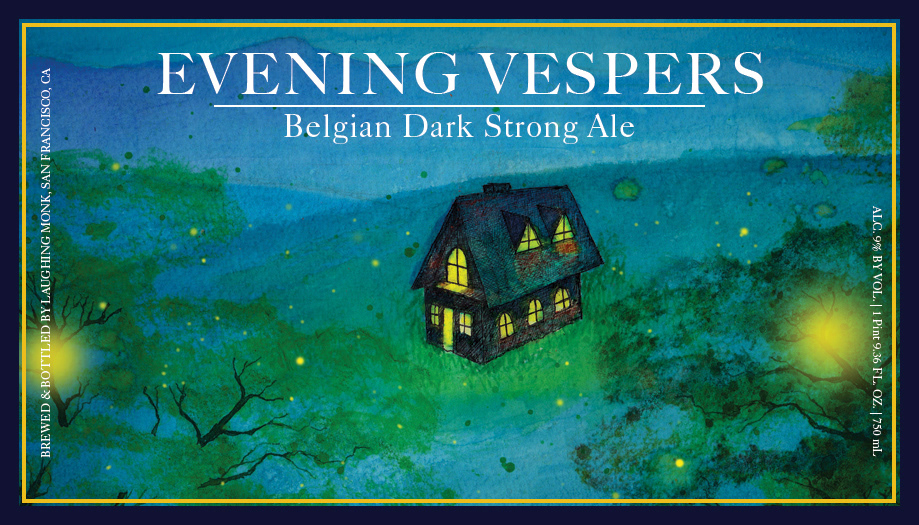
In addition, we explored label designs. And in a similar fashion as with the logo, I mocked up my hand-drawn illustrations into fine beer labels that aim to harken back to the earthiness of old-style Belgian beers.
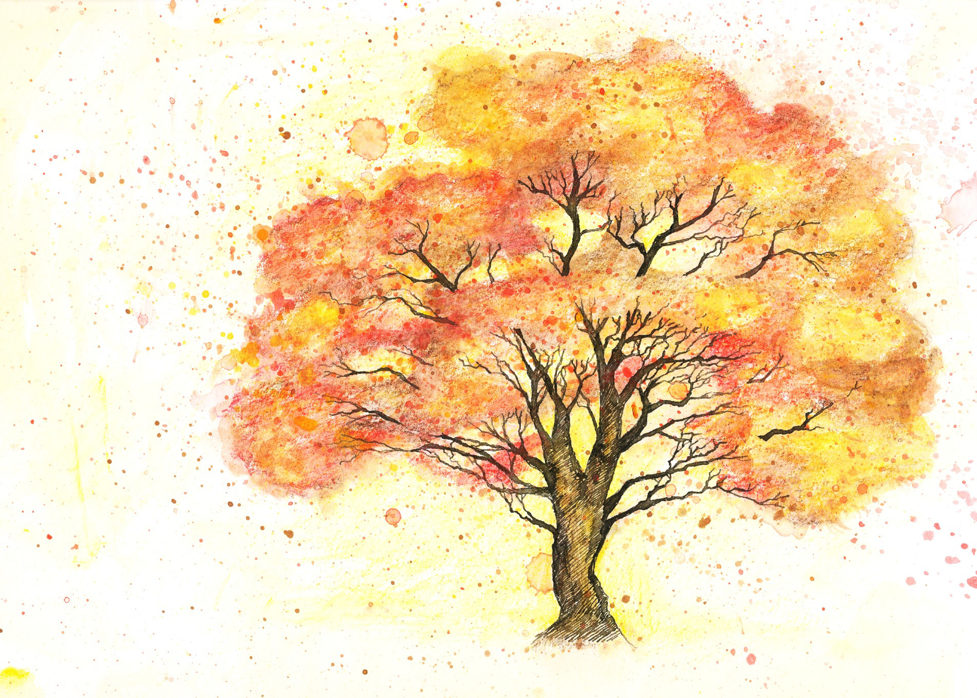
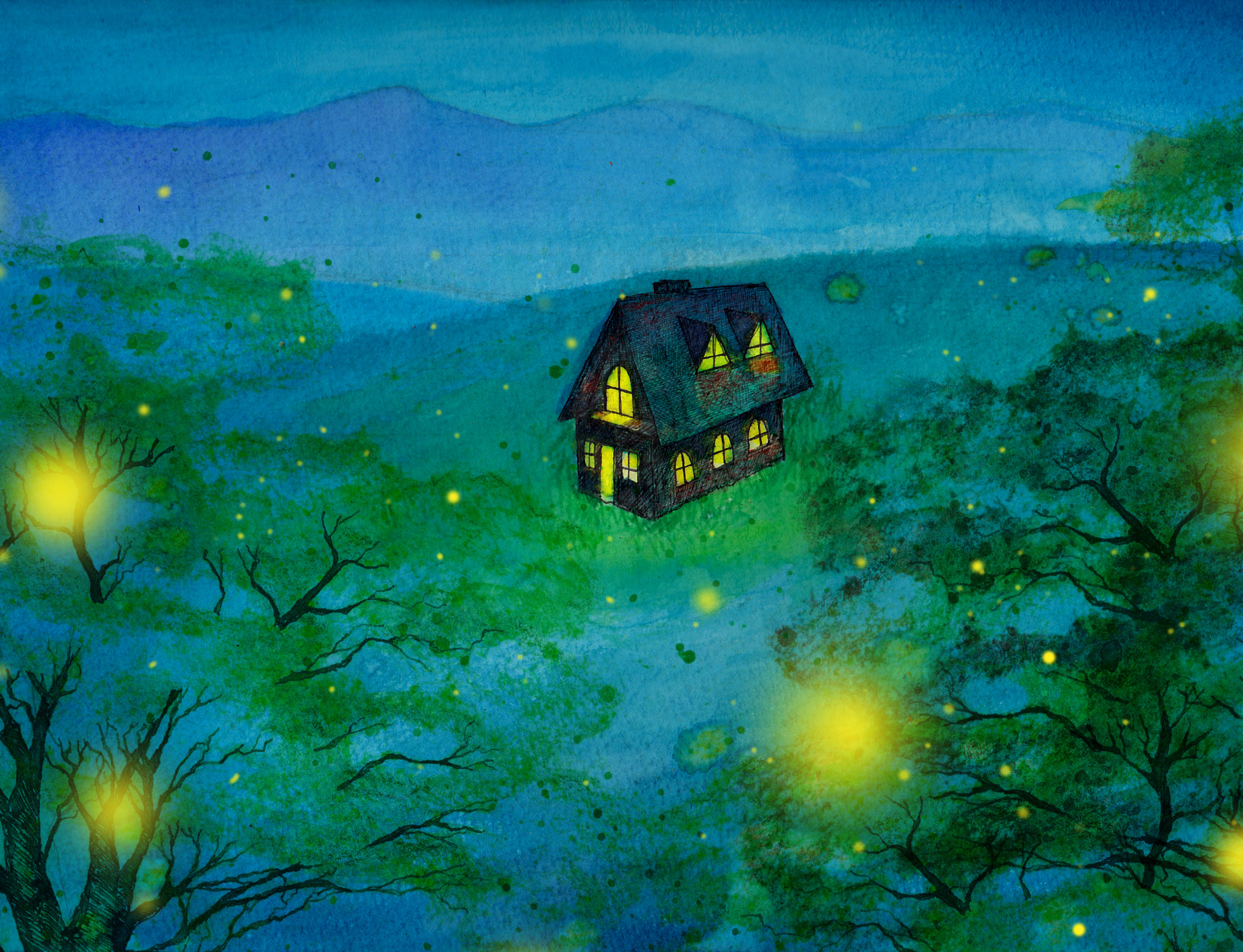
Despite being scrapped, I've included them here to demonstrate some of the process and development that I go through when I combine analog materials into the work. The illustrations below were originally done in ink and watercolor, afterwards they were scanned and manipulated digitally.
Despite being scrapped, I've included them here to demonstrate some of the process and development that I go through when I combine analog materials into the work. The illustrations below were originally done in ink and watercolor, afterwards they were scanned and manipulated digitally.